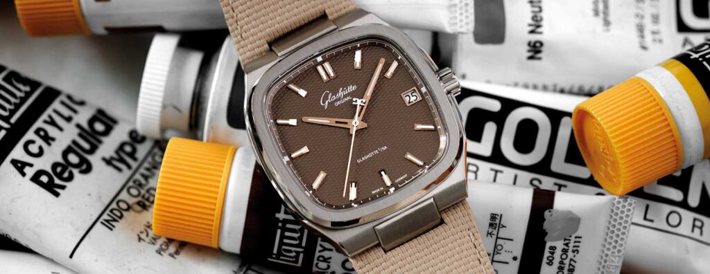
The Glashütte Original 70s is the sort of watch that doesn’t need to shout about its period influence.
Its square, television-shaped case carries the unmistakable mood of the decade that inspired it, yet the watch feels less like a costume piece than a study in proportion, color and restraint.
For a manufacture so closely tied to Saxony’s watchmaking history, that balance matters.
At a glance
- Glashütte Original has introduced the 70s, a sharper-named evolution of the watch previously known as the Seventies.
- The design centers on a square, television-style case with a calm dial layout and three confirmed dial directions.
- The watch is offered with silver or brown dials, alongside a limited-edition black version called “Vinyl Record.”
A television case with Saxon discipline
The 70s takes a very different route from Glashütte Original’s Pano watches, which are known for their asymmetrical layouts and deliberately off-center displays.
Here, the architecture is more settled.
The case is square without feeling severe, and the broad dial gives the design room to breathe rather than crowding it with visual tricks.
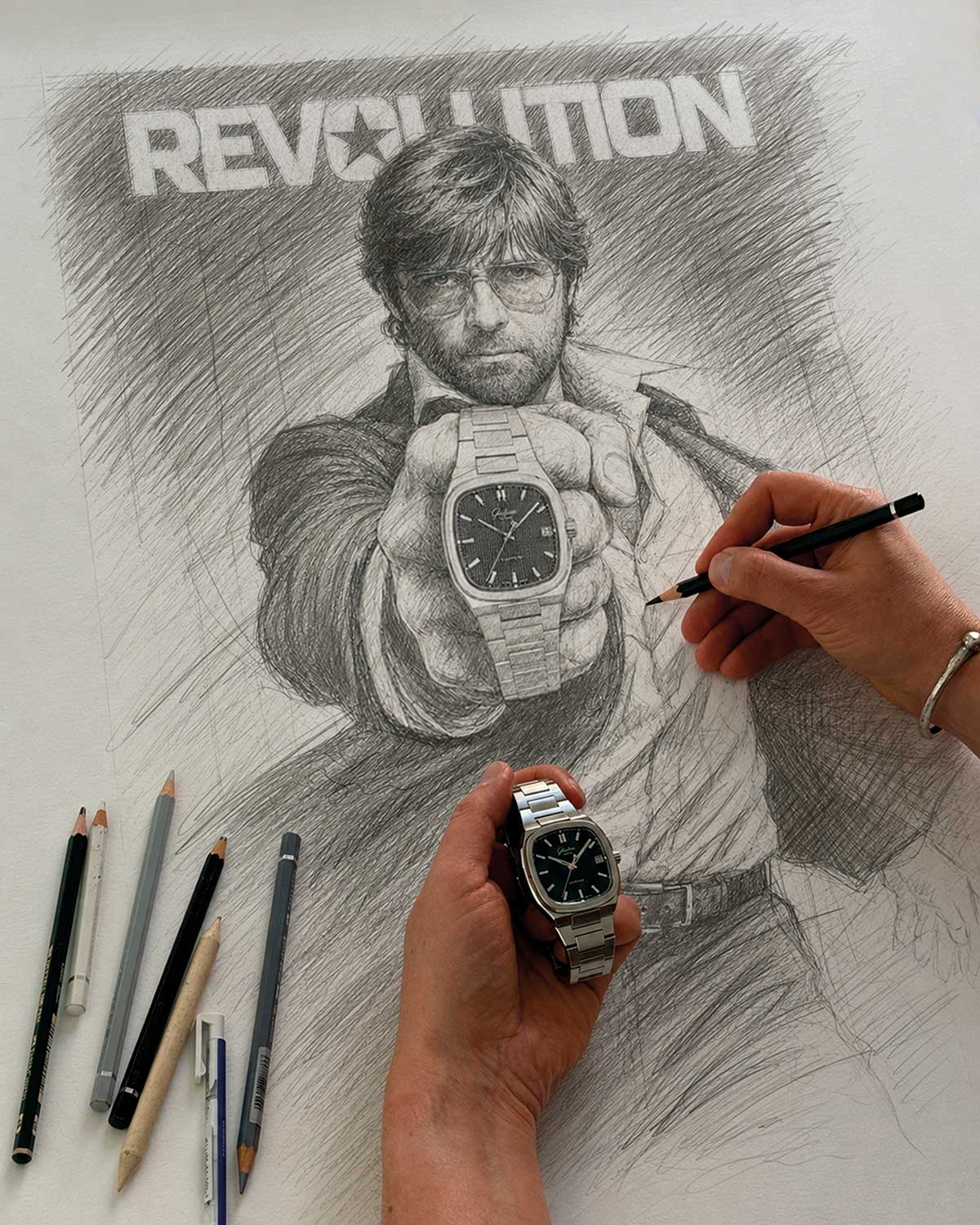
That television-case silhouette is a familiar shorthand for the 1970s, but Glashütte Original treats it with a certain sobriety.
The result is a watch that nods to the decade without becoming trapped by it.
It’s an important distinction, because vintage cues can easily turn into decoration when they aren’t held together by proportion.
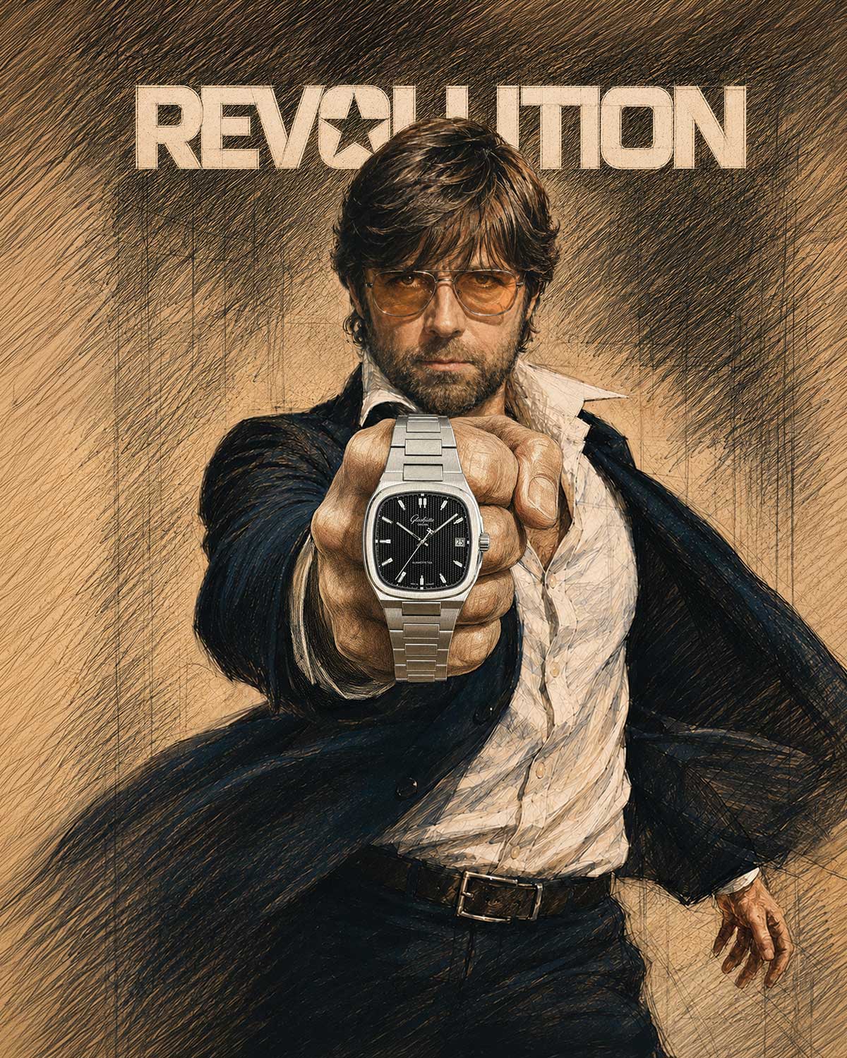
On the 70s, the shape, bezel and dial field work together in a way that feels considered from the wrist rather than merely photogenic from the front.
Michael Moebius and the memory of color
Artist and collector Michael Moebius offers an especially interesting lens on the watch, not least because his relationship with Glashütte Original began with the more unconventional Pano collection.
Moebius grew up in East Germany, where his memories of the 1970s are not softened into easy nostalgia.
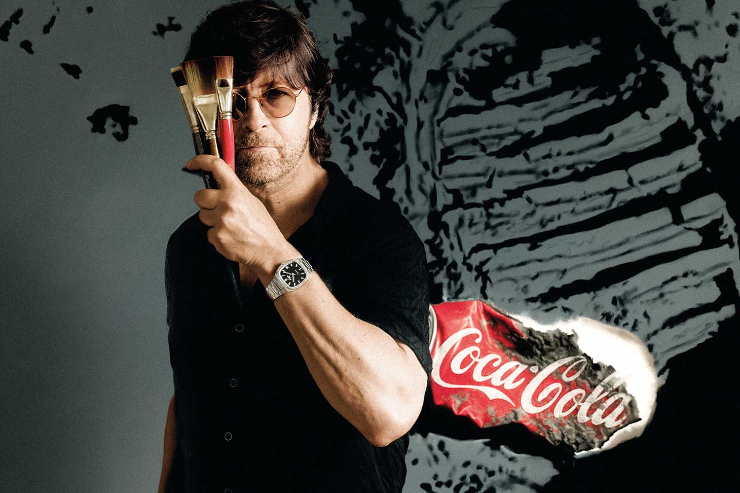
He has described the period as gray, repetitive and restrictive, while also remembering how childhood imagination still found color in unexpected places.
Disney cartoons, unofficially out of reach at the time, became small windows into another visual world.
That tension between limitation and imagination runs through his art, particularly in the vivid pop-art realism of his “Bubblegum” portraits.
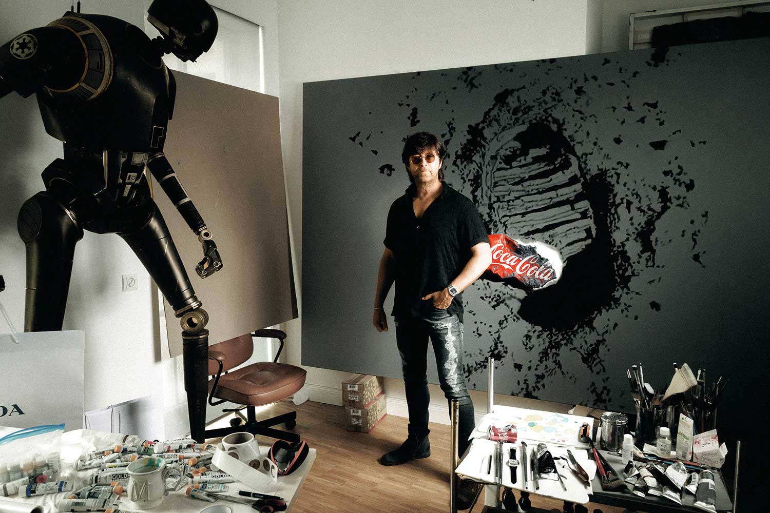
It also explains why the 70s feels more layered than a simple retro exercise.
The watch is tied to a decade of strong design language, but it also sits against a deeper cultural backdrop in which making, repairing and preserving craft carried its own meaning.
The quieter side of Glashütte Original
Moebius’s attraction to Glashütte Original has less to do with a single complication than with continuity of character.
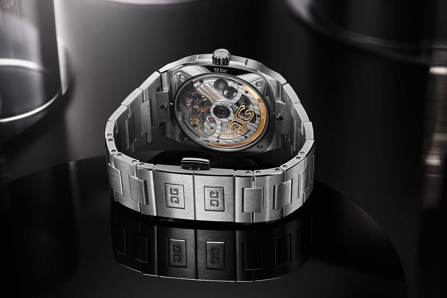
For him, the appeal lies in a manufacture that kept building fine mechanical watches by hand through difficult political realities.
That sense of identity is visible in the 70s, even though the watch presents itself with an easy, almost casual confidence.
Some watches ask to be studied because of their complexity.
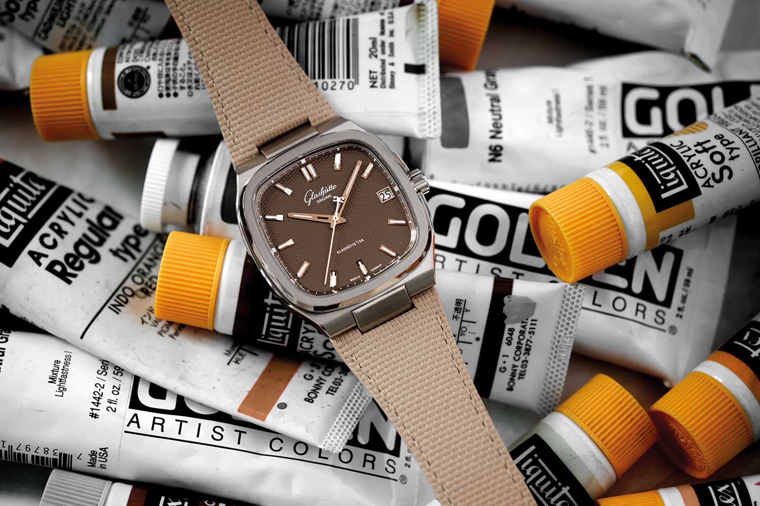
This one invites attention through clarity.
The silver and brown dial versions lean into wearability, while the limited black “Vinyl Record” edition draws a more graphic line to the era’s cultural soundtrack.
Each version uses the same essential canvas differently, which is why the design feels open rather than fixed to one mood.
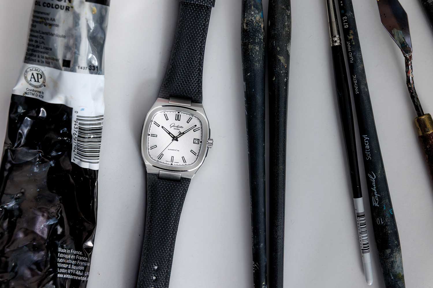
Details & Specifications
| Brand | Glashütte Original |
|---|---|
| Model | 70s |
| Previous name | Seventies |
| Case style | Square television-shaped case |
| Dial options | Silver, brown and limited-edition black |
| Limited edition | Black “Vinyl Record” version |
| Design character | Balanced dial layout with a large visual field |
The lasting strength of the Glashütte Original 70s is that it doesn’t treat the past as a mood board.
It uses a familiar shape to open a more personal conversation about design, memory and the stubborn endurance of Saxon mechanical watchmaking.