McLaren has introduced a new logo for its next generation of cars, and the timing feels deliberate.
Rather than leaning into visual aggression or motorsport excess, the British supercar maker has looked back to the place where Bruce McLaren’s fascination with cars began.
The result is a minimalist wordmark with a personal thread running through it, one that links the company’s future product push to a small family workshop in Auckland, New Zealand.
At a glance
- McLaren has revealed a new minimalist wordmark for its next generation of cars.
- The identity takes inspiration from signage once displayed above the McLaren family workshop in Auckland.
- The McL 6GT is the first model to wear the new branding, with wider use planned across cars, merchandise and digital platforms.
A wordmark from the family workshop
The new McLaren identity traces its influence to the signage that once sat above the workshop run by Bruce McLaren’s parents in Auckland.
That garage was more than a family business backdrop.
It was where Bruce McLaren spent time helping out, absorbing the mechanics, problem-solving and curiosity that would later define one of the most recognisable names in performance motoring.
For a modern supercar brand, that kind of design reference carries more weight than a simple badge refresh.
It gives the wordmark a human point of connection, reminding buyers and enthusiasts that McLaren’s story didn’t begin in a pristine design studio or on a corporate presentation slide.
The McL 6GT is first to wear the identity
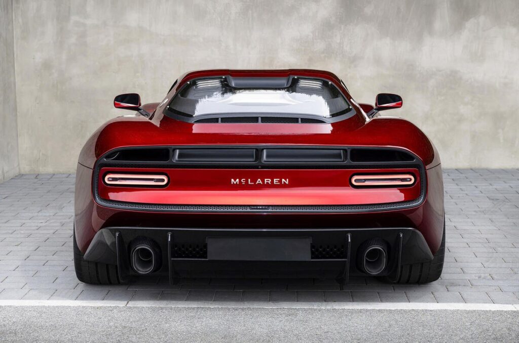
The recently unveiled McL 6GT is the first McLaren model to display the new branding.

Shown at Monterey Car Week in California last month, the car places the McLaren name prominently across the rear, making the wordmark a visible part of the vehicle’s design rather than a small finishing detail.
That placement also suggests how McLaren wants the identity to function on future models.
It’s less about ornament and more about recognition, especially as the company prepares to broaden its range.

The cleaner lettering should translate easily across bodywork, digital touchpoints and merchandise, which matters for a brand operating across both high-performance engineering and lifestyle-led visibility.
A subtle shift before a wider model expansion
Logo changes in the supercar world can be risky, because owners often have a deep attachment to familiar visual cues.
McLaren’s approach is measured.
The company hasn’t abandoned its name, its heritage or its performance-led identity, but it has reduced the branding language to something simpler and more adaptable.
That restraint fits the moment.
As McLaren moves toward a broader model range, a more unified visual identity gives the brand a cleaner foundation across vehicles, online platforms and retail merchandise.
The strongest part of the redesign is that it doesn’t feel detached from the company’s past.
By reaching back to the Auckland workshop connected to Bruce McLaren’s early years, the new logo frames the next chapter with a reminder of where the name first gathered meaning.
For collectors and marque loyalists, that connection will likely matter as much as the graphic update itself.
For everyone else, it’s a quieter kind of branding move, one that lets McLaren modernise without losing the personal history behind the badge.