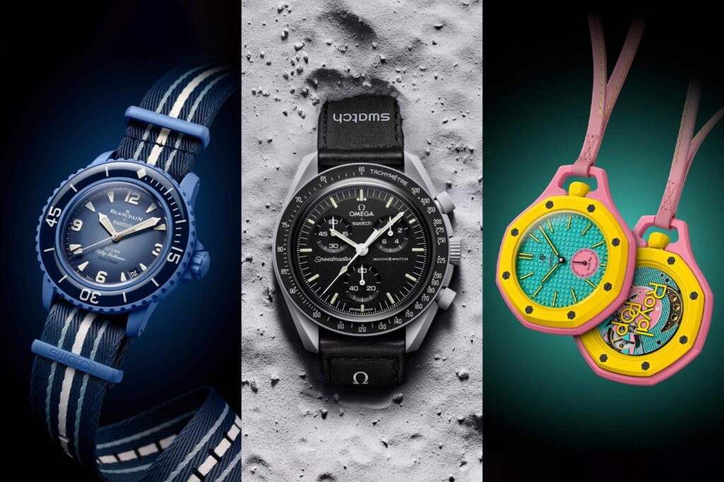
The most talked-about watches of recent years haven’t all come from rare metals, hand-finished movements or closed-door allocation lists.
Swatch has found a different route to desire, taking familiar silhouettes from heavyweight watchmakers and translating them into bright, lightweight, relatively attainable pieces that people actually queue for.
The formula began with the MoonSwatch in 2022 and has since expanded into a broader run of collaborations that includes the Scuba Fifty Fathoms and Royal Pop.

At a glance
- Swatch’s major modern collaborations pair its playful, accessible watchmaking with names including Omega, Blancpain and Audemars Piguet.
- Bioceramic is the key material across the MoonSwatch family, giving the watches their light feel, matte finish and vivid colour options.
- The MoonSwatch launched on 26 March 2022 from £240 through Swatch boutiques, with later editions adding new colours, Moonshine Gold hands, Earth-themed variants and a 1965 tribute.
Bioceramic gives the formula its personality
Swatch Bioceramic is central to the way these watches look and wear.
The material combines two-thirds ceramic powder with one-third plant-derived plastic made from castor bean oil, creating a case that’s light, hard and easier to shape than traditional zirconium oxide ceramic.
It also has a soft, almost silky touch and a matte surface that suits Swatch’s appetite for strong colour.

That matters because these collaborations aren’t trying to mimic steel luxury watches down to the last gram.
They work because they turn famous watch codes into something knowingly different, with enough familiarity to catch the eye and enough Swatch character to avoid feeling like a straight imitation.
MoonSwatch made the Speedmaster feel radically approachable
The Swatch x Omega MoonSwatch arrived on 26 March 2022 as a Bioceramic quartz chronograph inspired by the Omega Speedmaster Professional.

That was the jolt.
The Speedmaster is one of watchmaking’s most recognisable chronographs, tied closely to NASA history and the Apollo era, while Swatch is known for inexpensive, colourful quartz watches with a democratic streak.
Putting those worlds together created a release that felt closer to a streetwear drop than a conventional watch launch.
The first MoonSwatch collection included 11 celestial colourways, each linked to a planet or body in the solar system.
- Mission to the Sun used a bright yellow and white palette.
- Mission to Mercury went darker with grey and black tones.
- Mission to Venus leaned into pastel pink and white.
- Mission to Earth paired mint green with a dark blue dial.
- Mission to the Moon stayed closest to the classic Speedmaster look.
- Mission to Mars used red and nodded to the Speedmaster Alaska Project.
- Mission to Jupiter mixed dusty bronze with Ultraman-style orange accents.
- Mission to Saturn added a ringed Saturn motif on the six o’clock subdial.
- Mission to Uranus used pale blue and white.
- Mission to Neptune went for a deeper blue treatment.
- Mission to Pluto combined grey, cream and burgundy.
Every launch model shared the same basic architecture, with a 42mm Bioceramic case, 13.25mm height, quartz chronograph movement and 30 metres of water resistance.
The retail price was £240, with sales limited to Swatch boutiques.
The resale frenzy around the early MoonSwatch releases has cooled, but the watch still carries unusual cultural weight for something that costs a fraction of the mechanical chronograph that inspired it.
It appealed to Speedmaster fans who wanted a playful side piece, newer collectors looking for an entry point, and casual buyers who simply liked the colours and the story.
The MoonSwatch line keeps adding new angles
Swatch and Omega didn’t leave the MoonSwatch as a single-launch moment.
The Mission to Moonshine Gold editions added a gold-plated chronograph seconds hand using Omega’s Moonshine Gold, with each edition tied to the month in which that gold hand was produced.
Some versions introduced small seasonal details on the hand, including a barleycorn pattern for September’s harvest moon and strawberries for June’s strawberry full moon.
Most Mission to Moonshine Gold models used the grey Mission to the Moon case and black dial combination, while the Blue Moon version used the blue Neptune colourway.

Those editions retained the core MoonSwatch specifications and are no longer at retail.
The Mission on Earth series shifted the emphasis back to colour.
Lava uses a hot orange case with matching hands and hour markers against a black dial, Polar Lights trades the orange for turquoise and adds silver rings around the chronograph counters, while Desert moves into sandy beige tones.

Each Mission on Earth model keeps the 42mm Bioceramic case and quartz movement, with pricing at £240.
The MoonSwatch 1965 is the more restrained heritage play in the family.
It marks the Speedmaster’s NASA qualification on 1 March 1965 with a white dial, grey case, black tachymeter bezel, vintage-style Omega branding, period-leaning typography and older-style hands.

Its cleverest detail is the chronograph layout, where the hour indicator reads to 19 and the minute counter reads to 65.
That makes the date part of the watch’s display rather than a line of text on the caseback.
Swatch has also explored Moonphase versions within the MoonSwatch family, adding a moonphase display to the concept without moving away from the broader Bioceramic chronograph idea.

Scuba Fifty Fathoms and Royal Pop broaden the experiment
The MoonSwatch proved that Swatch could take a serious watchmaking icon and turn it into a mass conversation without stripping away its identity.
The Scuba Fifty Fathoms and Royal Pop continue that strategy through different watchmaking languages.
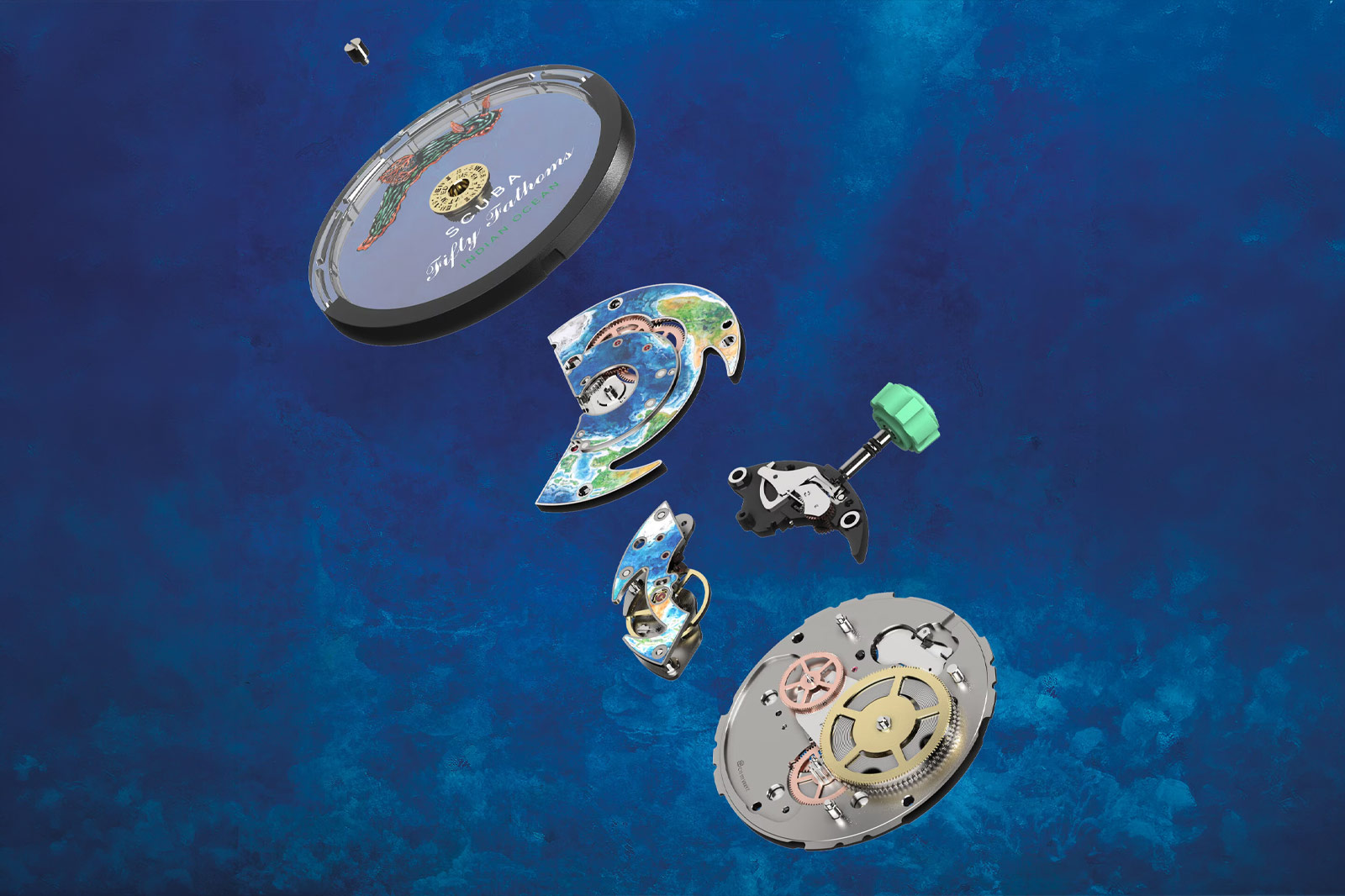
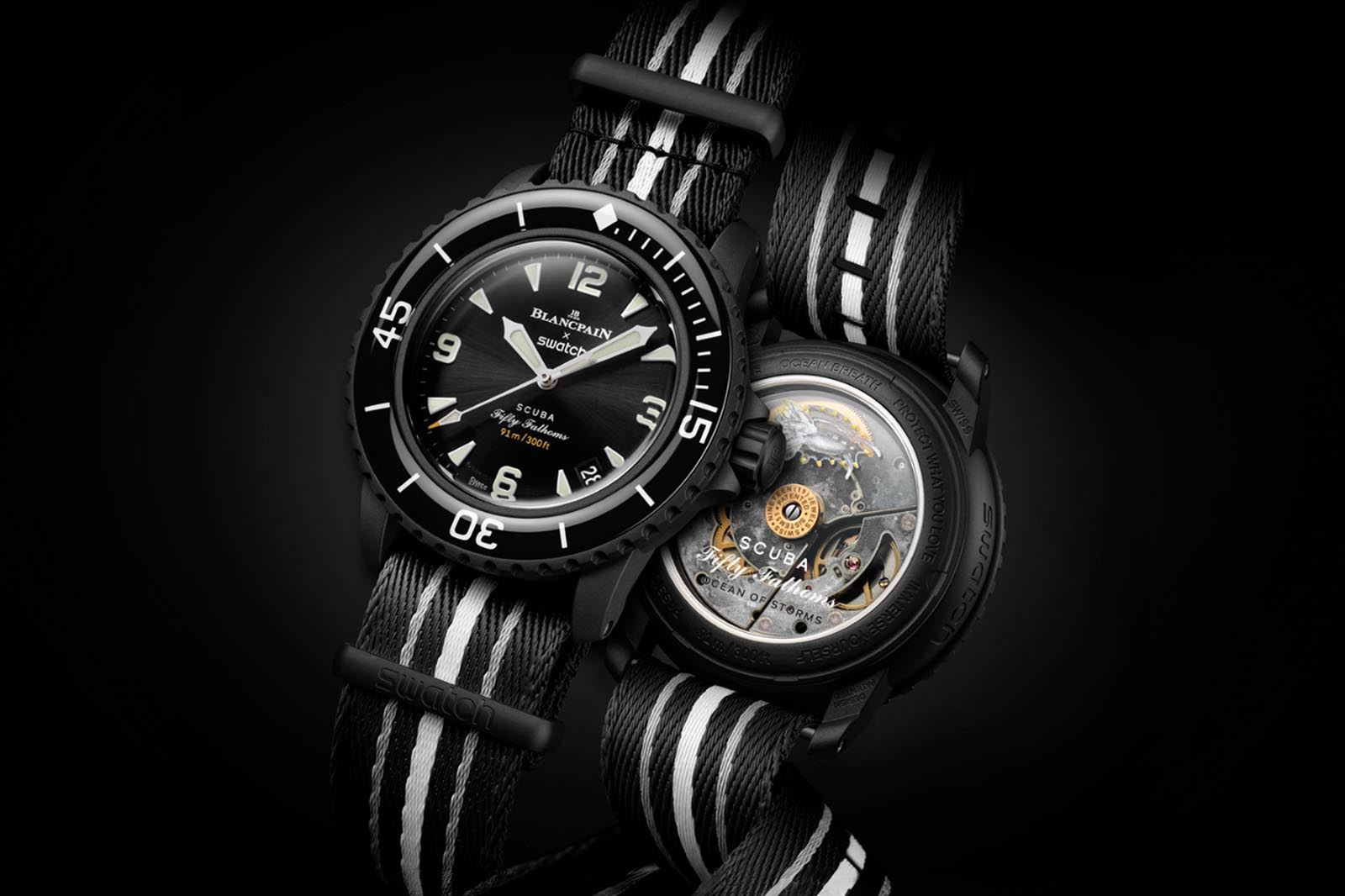
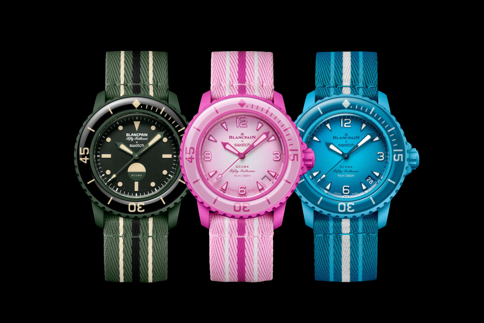
With Blancpain, the Scuba Fifty Fathoms taps into one of the great names in dive-watch history, moving the collaboration formula away from the chronograph and toward underwater design codes.

Where the MoonSwatch is tied to spaceflight and the Speedmaster’s NASA association, the Fifty Fathoms name carries its own weight through diving culture.
The Royal Pop points in another direction again, taking Swatch’s playful approach into Audemars Piguet territory.
That makes the trio especially interesting because it shows Swatch treating collaborations not as simple logo exercises, but as a way to translate recognised watch archetypes into a more casual register.

The appeal is also different from conventional luxury collecting.
These watches aren’t about scarcity in the traditional high-end sense, nor are they about mechanical prestige above all else.
They’re about participation, colour, recognisable design and the pleasure of wearing something that doesn’t take the iconography too solemnly.
Details & Specifications
| Brand collaboration | Swatch x Omega |
|---|---|
| Model family | MoonSwatch |
| Launch date | 26 March 2022 |
| Case size | 42mm |
| Case height | 13.25mm |
| Case material | Swatch Bioceramic |
| Movement | Quartz chronograph |
| Water resistance | 30 metres |
| Launch collection | 11 celestial colourways |
| Price | From £240 |
| Sales channel | Swatch boutiques |
Swatch’s collaboration era works because it understands that icons don’t have to remain locked behind intimidating price tags to stay interesting.
MoonSwatch, Scuba Fifty Fathoms and Royal Pop each make familiar watch design feel more open, more colourful and more conversational, which is exactly why collectors keep watching for what comes next.