A watch dial looks simple until you start reading it as design history.
Across centuries, it has shifted from ornament to instrument, from aristocratic theatre to military necessity, and from handcrafted decoration to a disciplined language of numerals, tracks, lume and negative space.
That evolution explains why a California dial feels different from a sector dial, why a railroad dial still looks so exacting, and why a sparse Bauhaus face can be as recognisable as any complication.
At a glance
- Watch dials have evolved through changing needs, from early ornamental pocket watches to highly legible military, railroad and modernist styles.
- Major breakthroughs in accuracy made minutes and seconds worth displaying, reshaping dial layouts around precision and readability.
- Historic styles including Breguet numerals, railroad dials, trench watch dials, California dials, Bauhaus layouts and gilt dials remain influential in modern watchmaking.
From ornament to readable time
The earliest portable watches were extraordinary objects, but they weren’t especially precise.
Many showed only the hour because minute readings had little practical value when a watch could be off by hours in a day.
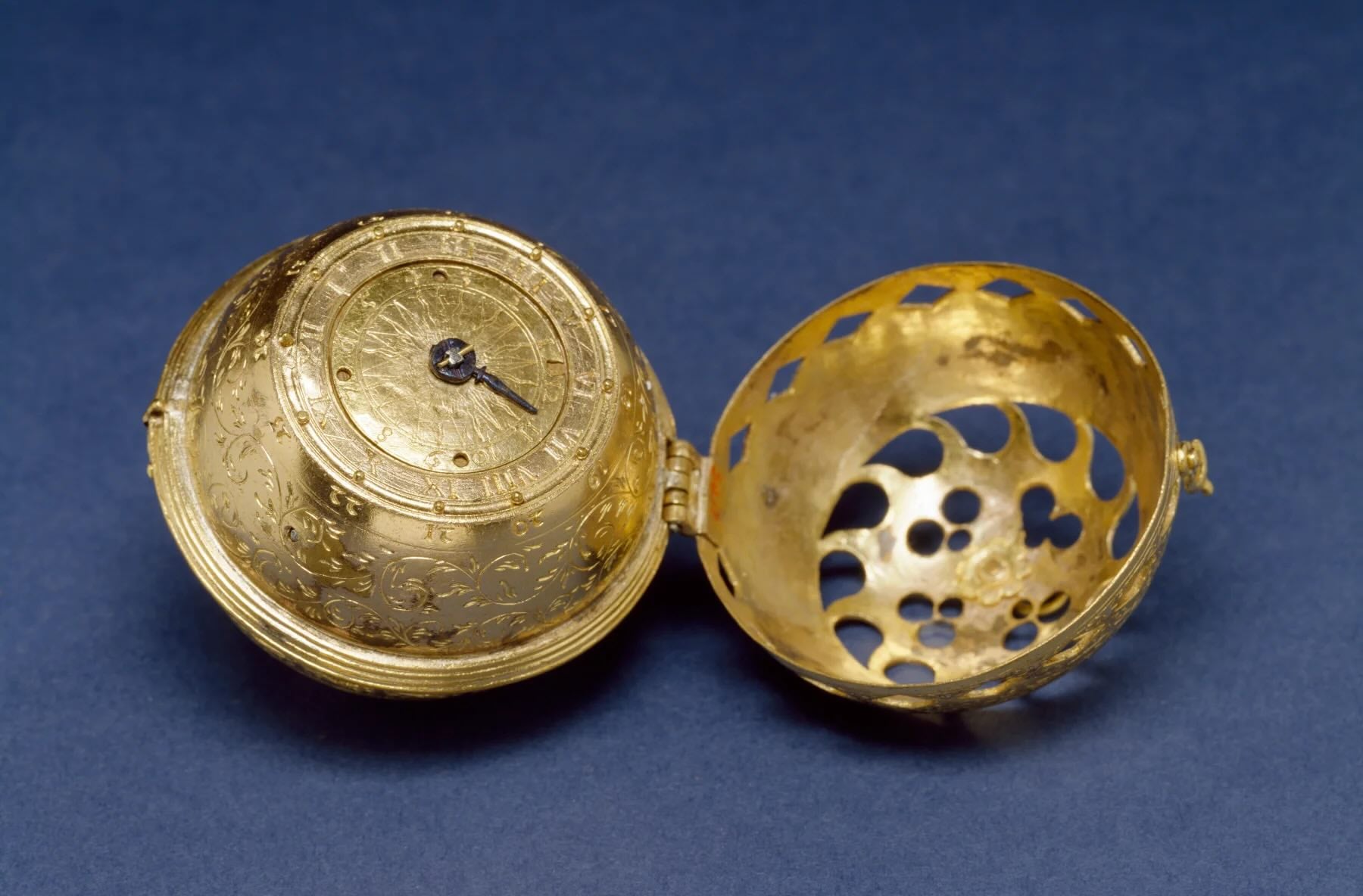
These early pieces are associated with the so-called Nuremberg eggs linked to German locksmith Peter Henlein, and they often had no crystal, relying instead on hinged metal covers to protect the exposed dial and hands.
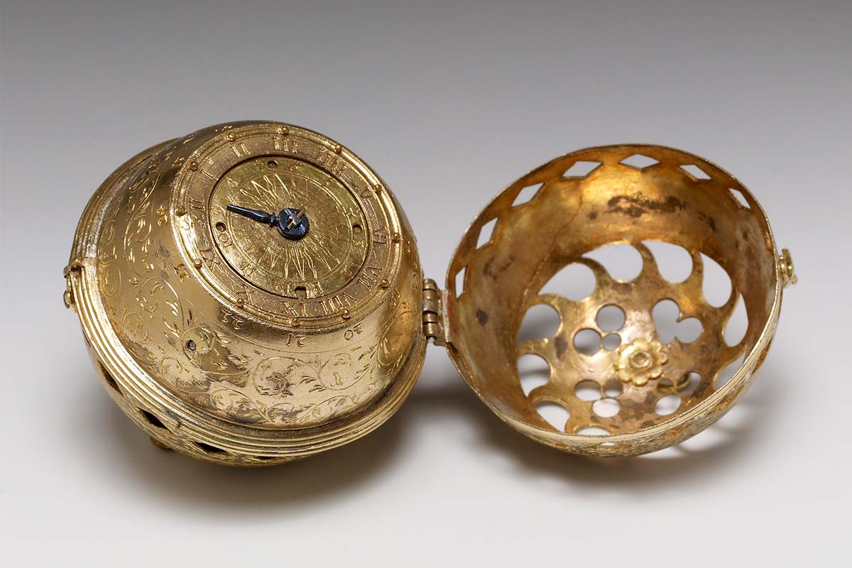
As objects for wealthy owners, they leaned heavily into display.
Engraved markings and Roman numerals gave way to richer decoration, with floral patterns, geometric motifs, animals and elaborate case work turning imperfect technology into portable status.
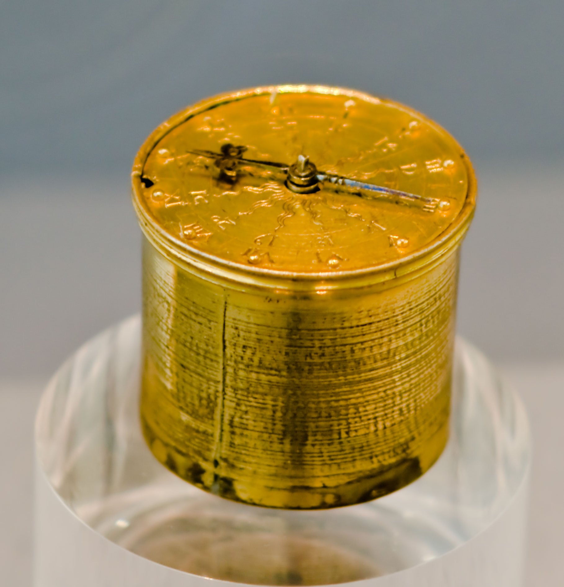
Before luminous paint, some experimental dials even used raised metal pins beside the hour markers so the owner could feel the time in the dark, with a longer pin at 12 o’clock to orient the dial.
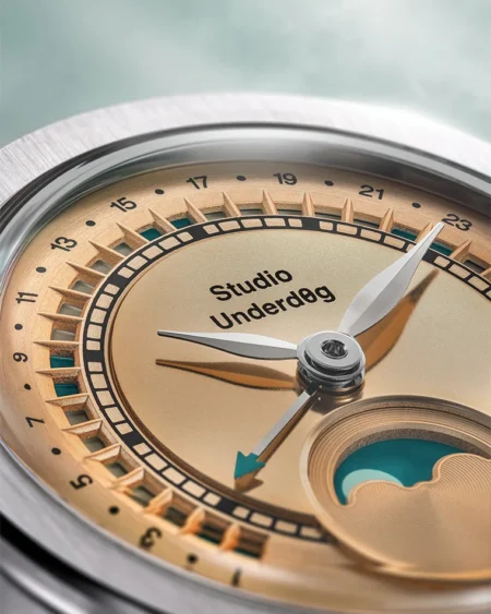
Vitreous enamel appeared in the 16th century as watchmakers explored brighter scenes and patterns, while astronomical indications brought rotating discs for moon phases, zodiac signs and the date.
The dial was already more than a surface for hands.
Precision changed what the dial had to say
The dial became more technical as timekeeping became more accurate.
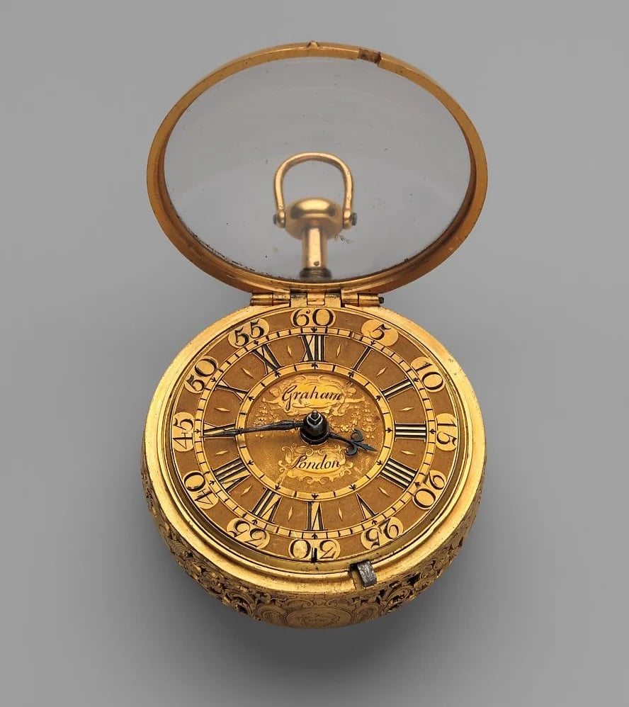
Dutch polymath Christiaan Huygens transformed horology with the pendulum in 1656 and the balance spring in 1675, two advances that made finer readings meaningful.
The pendulum took clock accuracy from 15 minutes or more per day to around 10 seconds, which helped bring the seconds hand into mainstream use.
The balance spring was even more important for watches, improving daily accuracy from errors that could reach hours to within a few minutes per day.
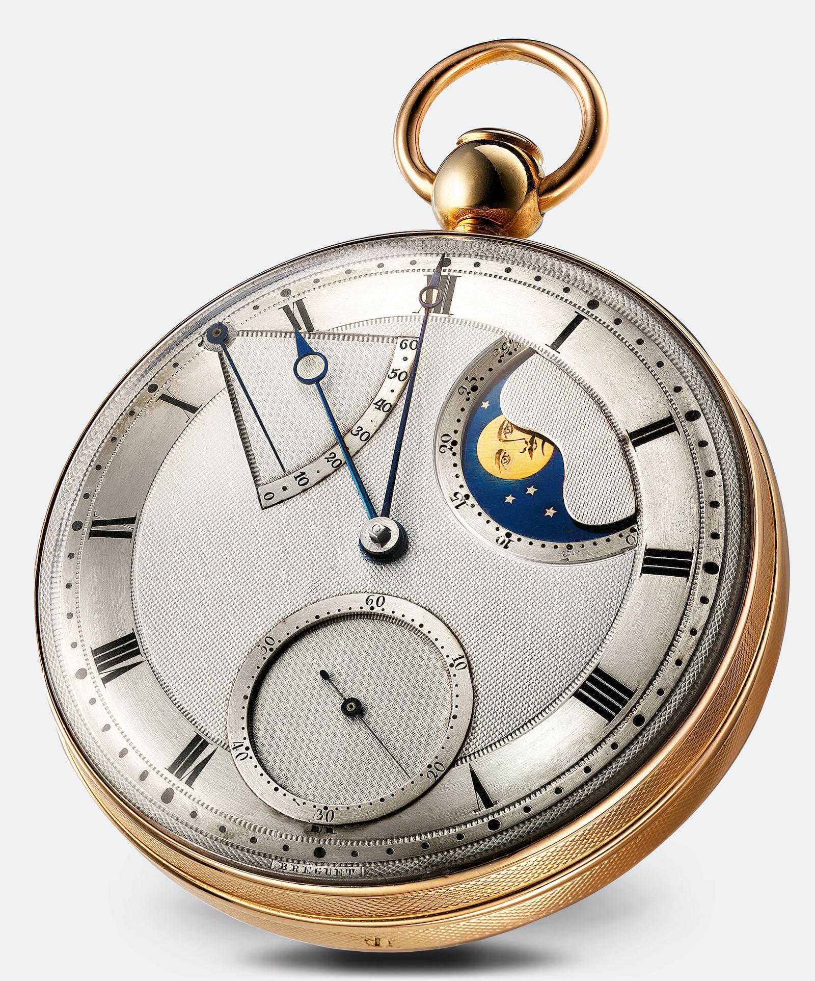
Once minutes and seconds mattered, dials had to show them clearly.
Detailed minute tracks, cleaner hour markers and more direct hand layouts became a visual expression of mechanical progress.
French watchmaker Jean-Antoine Lépine later pushed the pocket watch toward a thinner, more modern form with his 1764 Lépine calibre, which replaced the full movement plate with independent bridges and positioned the balance wheel on the same level as the gear train.

His dial language matched that shift.
The Lépine aesthetic favoured thin Arabic numerals, dotted minute tracks and generous negative space, offering a lighter alternative to heavier Roman numeral layouts.
He also used Arabic numerals consistently for hours and minutes, and his open-worked hands with arrow tips would influence later masters.
Abraham-Louis Breguet refined dial design with equal clarity.
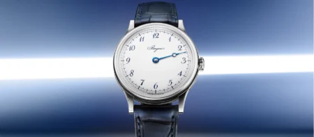
His calligraphic Arabic numerals, now known as Breguet numerals, leaned slightly to the right and were often paired with stylised five-minute markers.
Breguet hands, with their open circle near the tip, became another enduring signature.
His most consequential dial contribution may have been the use of guilloché on metal dials in 1786, where rose engine lathes created geometric patterns that added depth, reduced glare and separated dial areas with elegance and purpose.
Railroad and military dials put legibility first
Few environments sharpened dial design like the railroad.
As trains shared single tracks and met at precise sidings or stations, a watch running even a few minutes off could become dangerous.
After the 1891 Kipton collision in Ohio, which killed eight people and was linked to a conductor’s pocket watch being four minutes slow, Chief Time Inspector Webb C. Ball introduced stricter railroad timepiece standards.
Railroad employee watches were required to be accurate to within 30 seconds per week, and crews had to synchronise with central station clocks and with each other before shifts.
The dial rules were just as disciplined.
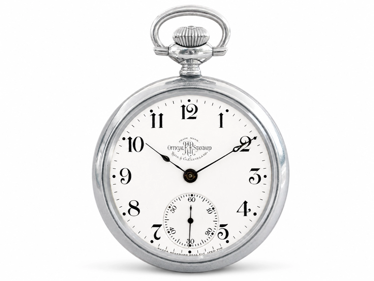
Ball’s standard called for open-faced watches, white enamel dials, large black Arabic numerals, clear five-minute markers and bold black or blued steel hands.
A substantial small seconds register at 6 o’clock used its own detailed track with Arabic numerals every 10 seconds.
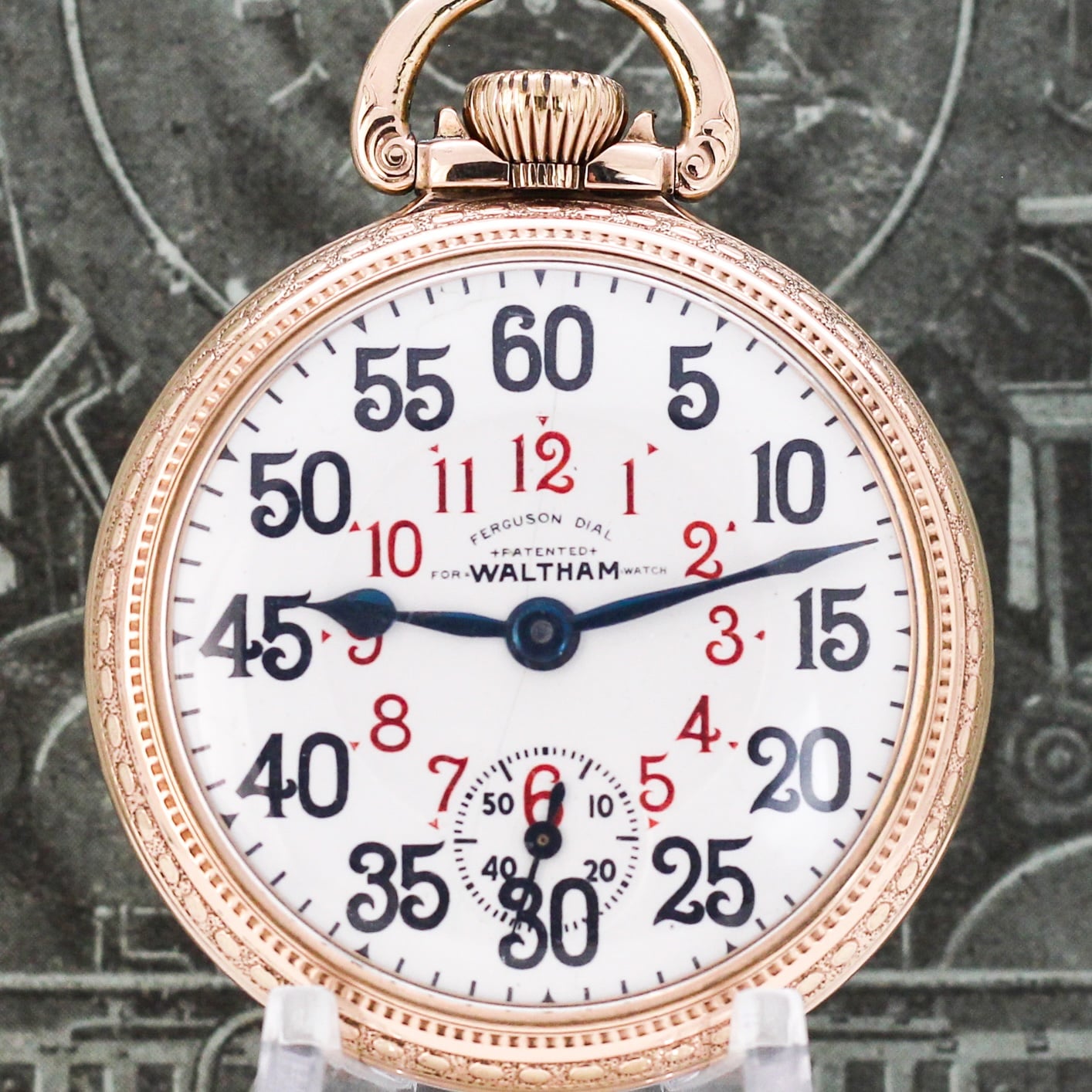
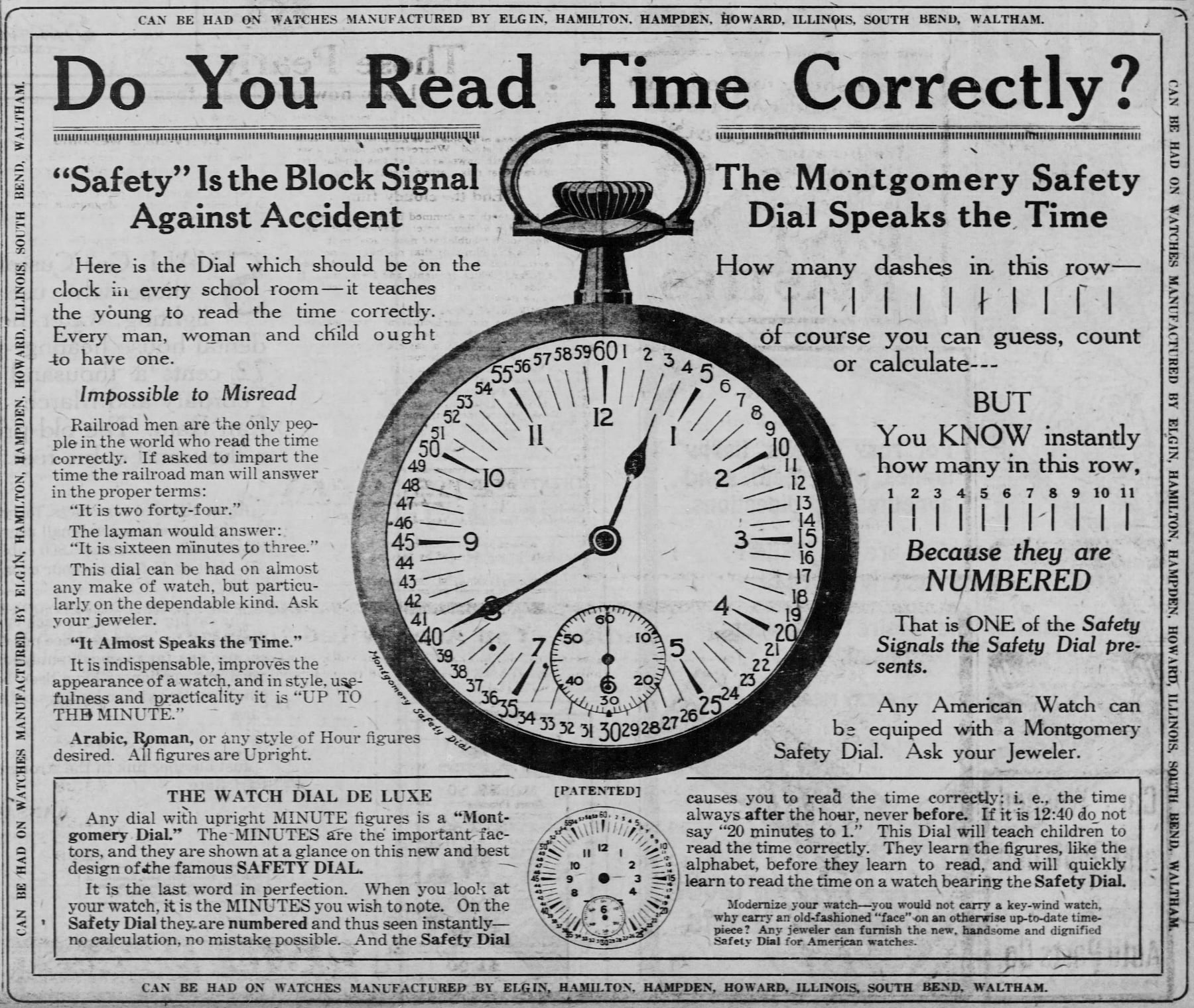
Henry S. Montgomery offered another influential answer in 1899 with the Montgomery Safety Dial.
It kept standard Arabic hour numerals but printed every single minute around the outer perimeter, with five-minute numerals in red.
It first appeared with the Santa Fe Railway on watches and station clocks, then became more widely used around 1910 by brands including Elgin, Hamilton, Hampden and Waltham on railroad-grade pocket watches.
War brought a different kind of urgency.
During the First World War, wristwatches moved from novelty and jewellery association toward field use, with soldiers wearing wristlets that ranged from converted pocket watches to dedicated wristwatch designs.
Legibility dominated, often through white or glossy black enamel dials, large Arabic numerals and luminous radium 226 paint on hands and numerals.
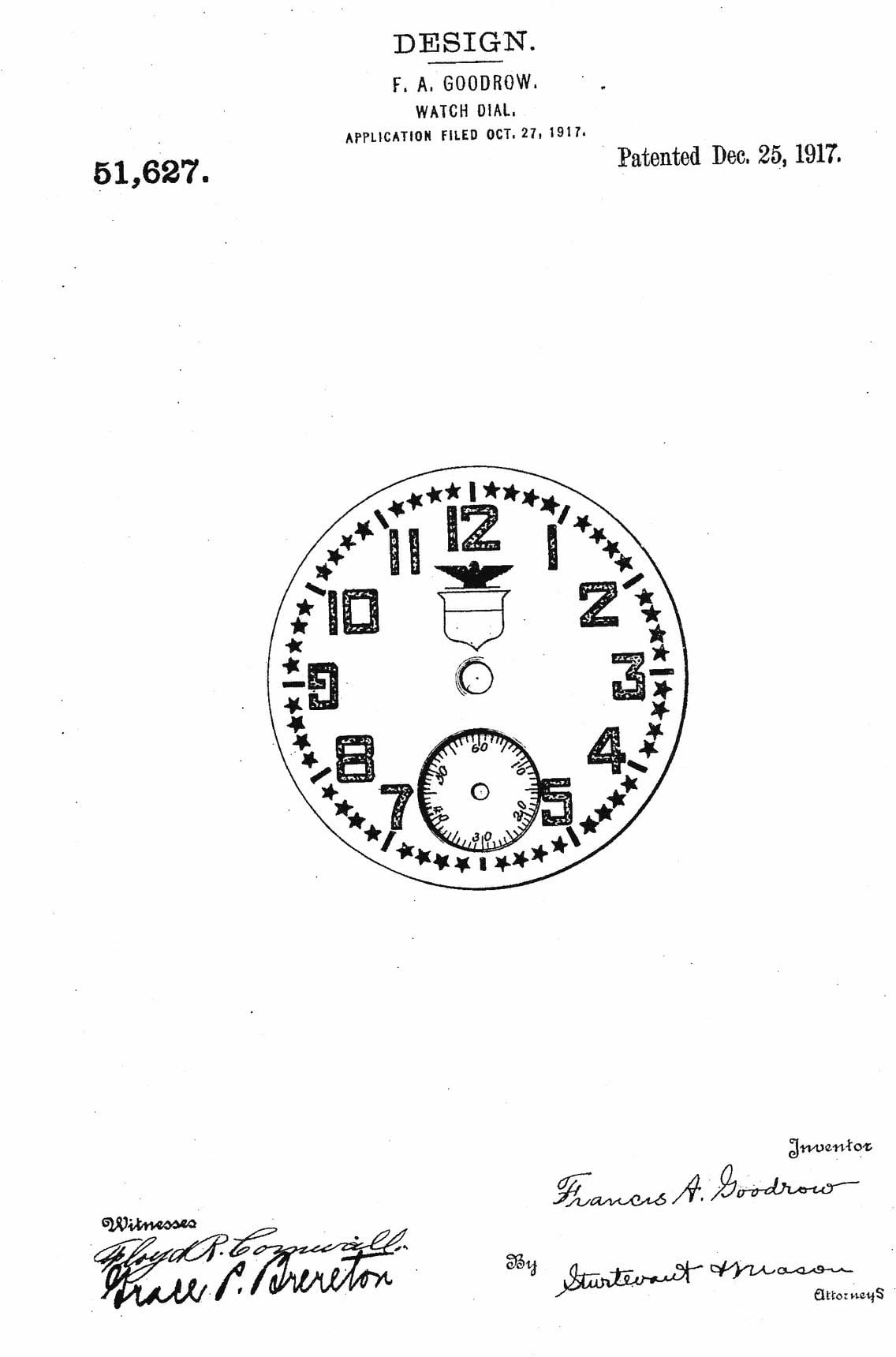
Elgin’s late-1917 Star Dial for US soldiers used oversized white Arabic numerals over black enamel, with white stars forming the minute track and a small seconds sub-dial at 6 o’clock.
Longines, Omega and Waltham made Officer Trench Dials with white enamel, large black Arabic numerals and protective hinged lids, often with grill designs that allowed the wearer to read the time underneath.
The Second World War produced one of the most recognisable American military layouts.
The A-11, issued to pilots and ground troops, debuted in 1942 from Waltham, Elgin and Bulova, and followed a standardised dial specification with a black face, white Arabic numerals and a white railroad-style minute and seconds track.
Its hand-wound movement had central hacking seconds, a practical feature for synchronising watches during operations including the D-Day landings.
Art Deco, California dials and Bauhaus restraint
After the First World War, returning soldiers helped change the cultural place of the wristwatch.
What had often been viewed as a feminine accessory became newly masculine, practical and fashionable.
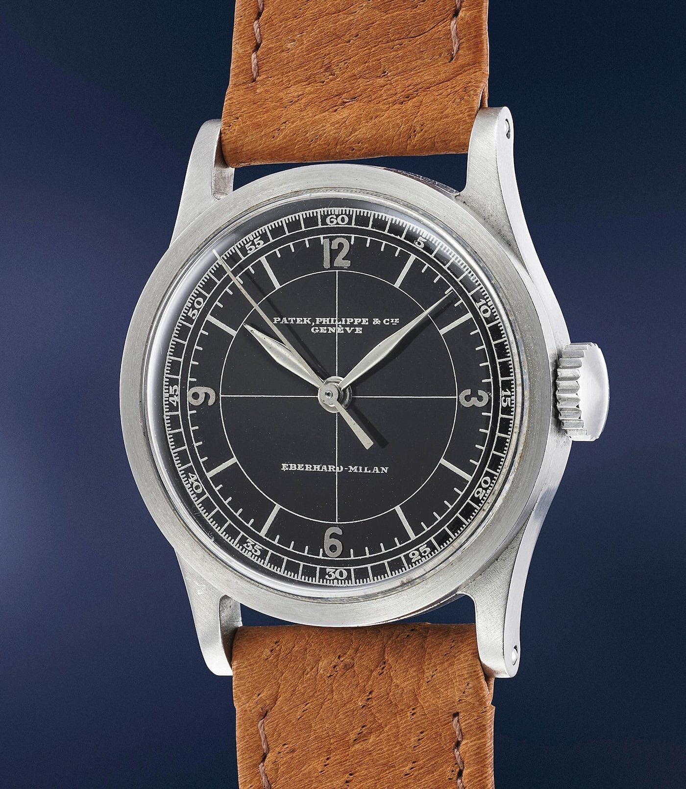
The 1920s brought Art Deco influence from architecture and the automotive world, and Patek Philippe introduced the geometric sector dial in 1924 with reference 421.
Sector dials used separate concentric rings for hours and minutes or seconds, arranged with a geometric order that later gained crosshair patterns in the 1930s.
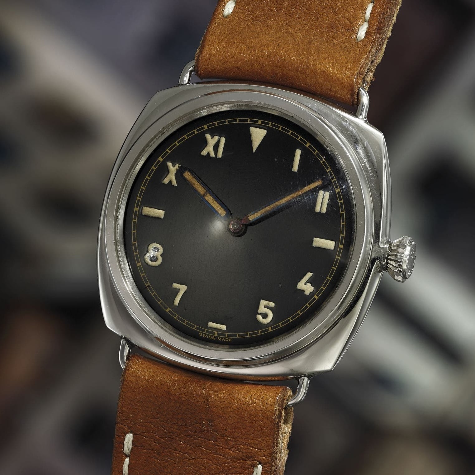
California dials emerged in the 1930s from Rolex, with a patent following in 1942.
The classic format placed Roman numerals across the upper half from 10 to 2 o’clock, Arabic numerals across the lower half from 4 to 8 o’clock, and horizontal markers at 3 and 9 o’clock.
Rolex marketed them as error-proof dials because they were easy for military divers to read underwater.
The style became closely associated with the wartime Rolex and Panerai partnership, including Radiomir reference 3646 models with Rolex movements and California dials for Italian Navy frogmen.
Modern California dials often reverse the arrangement, with Arabic numerals at the top, and the look remains visible in watches such as the Nomos Club Campus line and Panerai Radiomir California.
In Germany, Bauhaus influence moved dial design in the opposite direction from Art Deco drama.
The Pforzheim dial maker Weber & Baral produced clean Bauhaus-style dials in 1937 for A. Lange & Söhne and Stowa, using thin sans-serif typography and restrained layouts.
The closure of the Bauhaus School by the Nazi regime in 1933 helped disperse German designers through Europe and the United States, spreading modernist industrial design beyond Germany.
The lineage is still clear in the Junghans Max Bill series first introduced in 1961, the Nomos Tangente from 1992 and the Stowa Antea collection, which traces its roots to Weber & Baral’s 1937 work.
American designer Nathan George Horwitt carried Bauhaus thinking into one of the starkest dials in watch history.
His Museum Dial removed numerals, markers and text, leaving a single dot at 12 o’clock to represent a sundial at high noon.
The design became the first watch dial accepted into the permanent collection of the Museum of Modern Art in New York, and later became strongly identified with Movado after the brand adopted it around 1960.
Gilt dials and the appeal of depth
Not every important dial style was about reducing information.
Gilt dials, introduced in the 1930s and especially prominent from the 1940s onward, brought gold-toned numerals, chapter rings and text to black dials.
Brands including Rolex, Omega and Patek Philippe embraced the style, which carried both dress and sport associations.
True gilt dials were not simply printed in gold paint.
They began with a brass blank polished to a mirror finish, with the numerals and text masked or protected before the dial was darkened through galvanic treatment, black paint or electroplating.
Once the mask or protective lacquer was removed, the metallic brass showed through beneath clear lacquer, creating a sense of depth and changing character under light.
The golden age of gilt peaked in the 1960s with references such as the Rolex Submariner 5512 and 5513, Explorer 1016 and GMT-Master 1675, along with the Tudor Submariner 7928 and lines from Universal Genève including the Polerouter and chronographs.
By the late 1960s and into the 1970s, many watches moved away from true gilt methods toward more conventional production.
The Rolex Explorer 1016, for example, shifted around 1967 from glossy gilt dials to matte black dials with painted text.
Today, the look is still widely referenced through modern techniques such as gold-toned pad printing on black dials, seen in watches including the Tudor Black Bay and Oris Divers Sixty-Five.
That is the quiet power of the dial.
It can mark a mechanical breakthrough, serve a safety standard, support a military operation or capture an entire design movement, all while doing the same essential job of telling the time.